
The Information Density Trade-off: Balancing the Amount of Data Shown Against the User’s Ability to Digest It Quickly
Introduction: The Orchestra of Information
Imagine an orchestra where every instrument plays at once, each musician competing for attention. The sound becomes a blur no melody, no rhythm, just chaos. Dashboards and reports overloaded with data work the same way. When designers and analysts fill every inch of space with numbers, charts, and metrics, they risk turning insight into noise. The art of data storytelling lies not in the quantity of data presented but in its harmony balancing information richness with cognitive clarity.
In today’s digital environment, where attention spans shrink and decision cycles accelerate, mastering this balance determines whether insights enlighten or overwhelm. This is where professionals trained through Data Analytics courses in Delhi NCR learn to transform complex data into comprehensible stories that drive decisions.
The Cognitive Load Dilemma: When Too Much Becomes Too Little
Think of your brain as a limited-capacity processor. When too many data points flood in simultaneously, comprehension slows down, and decision quality declines. Psychologists call this cognitive overload, and in analytics, it often manifests as dashboards that try to tell too many stories at once.
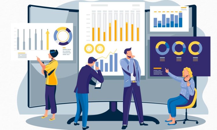
A retail dashboard, for instance, may display sales trends, customer churn, regional performance, and inventory turnover all on one screen. The intent is noble: give users everything they need. But in reality, such density creates friction. Users skim rather than study, losing context and meaning.
The solution lies in segmenting information. A dashboard could start with high-level KPIs and allow drill-downs for details. This layered approach gives users the freedom to explore without being buried. As learners in Data Analytics courses in Delhi NCR often discover, clarity isn’t achieved by removing information it’s achieved by structuring it intelligently.
Signal vs. Noise: The Hidden Cost of Over-Detailing
In any dataset, not all metrics are created equal. Some reveal patterns, while others distract. The more noise you include, the harder it becomes to hear the signal.
Consider a marketing report that displays 30 metrics per campaign, including impressions, clicks, CTR, CPC, engagement rate, view time, and more. Without hierarchy, the reader cannot tell which metrics matter most. When visual clutter dominates, insights vanish.
The best designers act as data curators. They use hierarchy bigger fonts, colour contrast, and positioning to direct attention. Each chart should answer a question; if it doesn’t, it’s redundant. The rule is simple: show as much as necessary, not as much as possible. Every pixel should justify its presence.
The Role of Context: Information Without Framing Is Just Data
Data without context is like a compass without direction. Imagine seeing “revenue increased by 5%” on a dashboard. Is that good? Compared to what? Last month’s 10%? The competitor’s 12%?
Context transforms data into narrative. Good dashboards weave comparisons, timeframes, and benchmarks to tell a complete story. They show not just what happened but why. For example, a monthly revenue chart annotated with product launches or market changes makes patterns immediately meaningful.
Designers must also consider the audience. A C-suite executive may need high-level summaries, while a data engineer might crave granularity. Tailoring the density to the audience’s expertise ensures engagement without overload. The same dataset can and should look different depending on who’s viewing it.
Minimalism with Meaning: The Power of White Space
White space isn’t wasted space it’s breathing room. Just as silence gives music its shape, space allows visuals to stand out and thoughts to settle. Minimalism in dashboard design doesn’t mean stripping away richness; it means amplifying what truly matters.
Imagine a performance dashboard that displays only three KPIs Revenue, Cost, and Profit Margin supported by trend lines and context notes. At first glance, it looks deceptively simple. Yet, such focus invites interaction. Users can drill deeper when curiosity strikes rather than being assaulted with detail from the start.
Colour palettes, typography, and spacing should all serve one purpose: guiding attention. When used deliberately, these design tools help users absorb information at a single glance.
Designing for Digestibility: Lessons from Everyday Interfaces
Think about your smartphone home screen. You don’t see every app in existence only the ones you use most. The rest are categorised or hidden in folders. Dashboards should follow the same principle: prioritise relevance and allow discovery.
Progressive disclosure showing key information upfront and revealing details as users interact is an effective way to manage information density. It respects user intent and mental bandwidth. Combined with consistent visual language and familiar layouts, it builds trust and speeds comprehension.
Ultimately, dashboards are not just analytical tools they are conversation starters between humans and data. When designed thoughtfully, they reduce friction, enabling decisions at the speed of thought.
Conclusion: From Overload to Insight
Information density is not the enemy; imbalance is. Like a symphony conductor deciding which instruments take centre stage, the analyst must orchestrate data with rhythm and restraint. The goal is not to simplify data, but to make complexity comprehensible.
The best dashboards speak softly but powerfully. They don’t demand attention they earn it. They respect the user’s time, focus, and curiosity. And in doing so, they transform numbers into narratives and visuals into understanding.
Balancing information density is both science and art a skill honed through practice, reflection, and the proper education. For those eager to master this equilibrium, structured learning paths, such as Data Analytics courses in Delhi NCR, offer a foundation not just for analysing data but also for communicating it with clarity, precision, and purpose.

